Fall Wedding Inspiration: Sabrina & Christian
Fall Wedding Inspiration: Sabrina & Christian
It's Fall wedding season, friends!
When the summer season comes around, I'm always one step ahead. I'm thinking FALL - classic, elegant, and relaxed - just how fall can be for some! I'm really feeling the fall neutrals vibe right now, so that's when I thought up the Sabrina and Christian Collection!
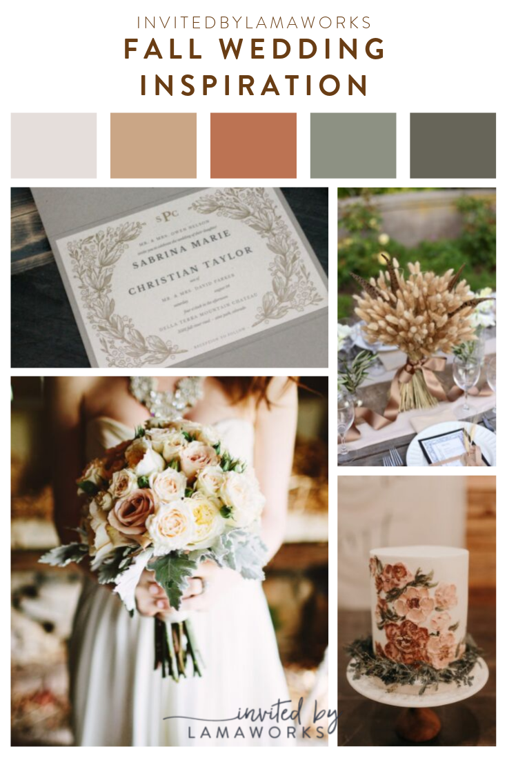
This pocket invitation starts with one of my favorite pocket colors - a duplexed paper that is shimmery silver on the outside, but a matte gray on the inside -- SWOON!
The laser cut scalloped design on the pocket really stands out with the mix of shimmer and matte. All of the printed cards in here are what I like to consider a neutral alternative to ivory. Putty is used for the invite and RSVP card - its a few shades darker than ivory and is very rustic without being so rustic that it's a brown kraft paper. It pairs nicely with the info card and envelope that are in a cool almond. The contrast from piece to piece is subtle, but it's like a well designed outfit - strikingly intentional.


What I especially love about this set is that you can customize it to fit your day! If you are more traditional, maybe go with white or ivory. If your wedding day is more romantic, add in a hint of blush pink. You can swap out colors or pocket styles, or go without a pocket at all! Add in belly bands, wax seals, or lace - anything to make it fit just what you envision for your wedding.
A bit of inspiration
What's really nice about Fall Weddings is that you can kind of make it what you want - and that goes for any wedding. Into more of a bolder look? Use more saturated colors. For me, I'm really into the muted colors and neutrals. For some reason, the vibe of wheat and barley really inspired me for this one! I even featured the mood board these are featured in.


Dare to be different
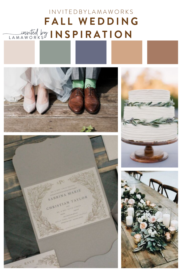
If you're not into the orange, sunset, or rust tones, you might also consider incorporating some dusty blues into your wedding. You can still feature your fall neutrals and greenery, with adding a little pop of something unexpected. This could make your fall wedding really stand out and have a bit of a brighter vibe! The mood board below shows how you can tie the colors together to create a beautiful color scheme!
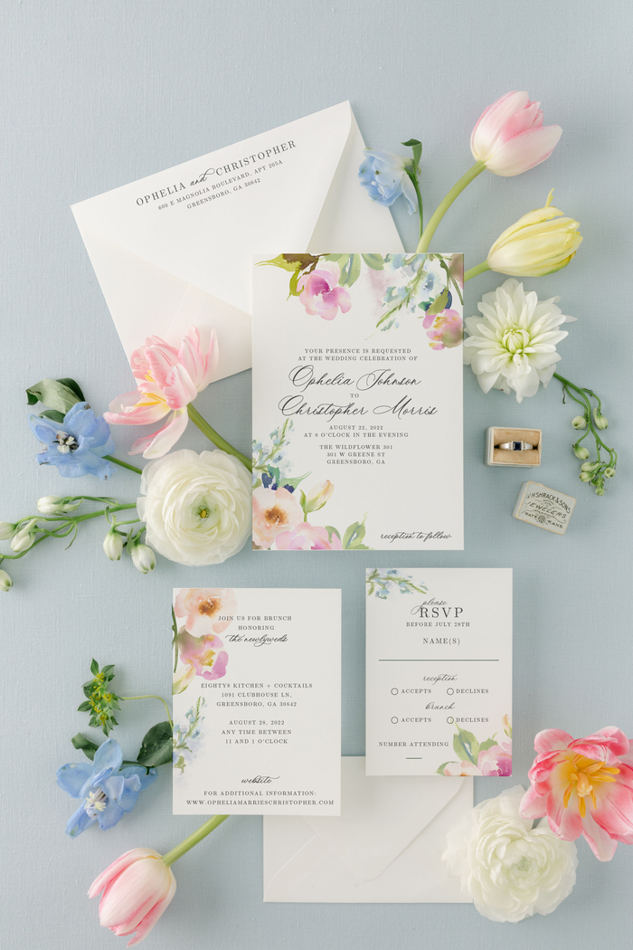
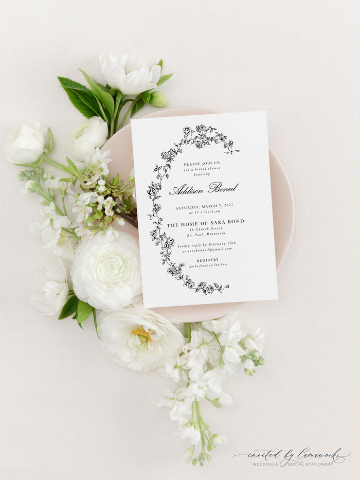
If you're not into the dusty blues, maybe look into the more pink route! This design I based on the original style of the Sabrina and Christian collection shows that you can still have simple while standing out! This design features white ink and minimalist line-drawn flowers. This square design features clean, simple design elements including a classic monogram and line drawn floral envelope liner. All of the colors here are natural, earthy and organic.


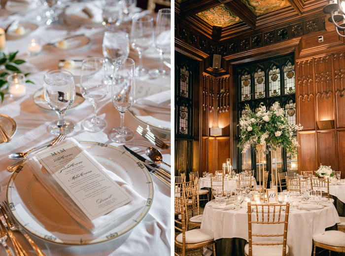
If you go the darker burgundy-mauve neutral route, you may like some of the elements from the boho photo shoot I did with Sara Elizabeth Weddings! It pulls in some navy, some pinks, and allllll the greenery! You can find the full blog post for it here to find some more inspiration.


Love the neutrals? Want that boho vibe? Is rustic your style, or are you more classic? Start designing your wedding with me today! Send me your wedding mood boards and we can figure out what style works best for you and your style. Happy Wedding Planning!

0 comments